In my logo draft I decided to change my entire logo around to something that was more appealing in my opinion. I still wanted to keep my logo fairly simple but more interesting which I think was accomplished. For the music note I used the line tool for the main part but realized that I would need a more flexible tool to elongate the top part of the note. The arc tool seemed to be the most appropriate. For the bottom portion of the music note, I added an ellipse and filled it in, using the fill tool, with black to get an all around solid shape. For the plus sign, I kept it simple once again by simply using the line tool, however ensuring that it was thick enough hence I adjusted the point value of it. I used the ellipse tool for the second time for the basketball and needed to add the detail inside the ball so ignorer to get the effect I needed I decided that the arc tool would be appropriate to use. I used a vivid orange to fill the basketball in order to help my logo stand out. For the font, I spent quite a lot of time contemplating how complex or simple I wanted it to be. Initially I had a more elaborative font however I ended up going with a more simplistic font. I put the name of my blog right on top, while still making sure that my tagline resonated with my audience. I figured the more I incorporated the tagline, the more memorable it would be. Ultimately, I intended for the overall logo to fall into the shape of a mixtape which is something I intend to render and enhance once completing my final draft.
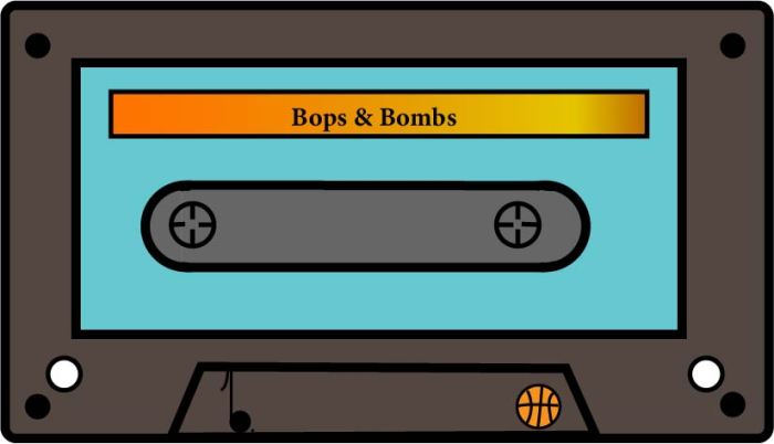
My final logo I expanded the idea of my of using a mixtape as the main focal point and I think it turned out pretty good. I googled a few pictures just to get the shape in my brain and went to work using the rounded-rectangle tool along with the rectangle and ellipse tool. I used some elements from my draft logo which are located on the bottom of the tape.
